Interacting with the Visualization
Data visualization benefits enormously from user interaction – particularly interactions that allow users to explore their data and interactively generate new views. Clustergrammer produces highly interactive heatmaps that enable users to intuitively explore their data and perform complex data transformations. Clustergrammer visualizations are built using the Clustergrammer-JS library and are consistent across the Clustergrammer-Web and the Clustergrammer-Widget. This section will overview heatmaps as a visualization tool and cover Clustergrammer’s interactive features.
Clustergrammer2 Video Tutorial
This tutorial shows how Clustergrammer2 can be run on the cloud (using MyBinder) and some of Clustergrammer2’s interactive features. For additional examples with real world data (e.g. scRNA-seq data), please see Case Studies and Tutorials.
Introduction to Clustergrams
Clustergrammer visualizes high-dimensional data as a hierarchically clustered matrix with colored matrix-cells (red for positive numbers and blue for negative numbers) and row/column labels. This type of visualization is commonly referred to as a heatmap or clustergram and this documentation uses these terms interchangeably; refer to Eisen et al., 1998 for an early example using biological data. Clustergrams also typically use dendrogram trees to depict the hierarchy of row and column clusters produced by hierarchical clustering.
Heatmaps are powerful visualization tools that enable users to directly visualize high-dimensional data without the loss of information and interpretability associated with dimensionality reduction techniques (e.g. t-SNE). For instance, columns can depict data-points (e.g. measured entities) and rows can depict data-dimensions (e.g. measured variables). In this way, heatmaps can visualize thousands of data-points in thousands of dimensions (e.g. data in thousand(s)-dimensional space). However, static heatmaps are of limited use for visualizing large datasets because visualization elements and labels become too small to read. Furthermore, static heatmaps prevent users from interactively exploring their data, e.g. reordering rows/columns. We built Clustergrammer to address these problems and to extend the capabilities of heatmap visualizations.
Zooming and Panning
Clustergrammer allows users to zoom into and pan across their heatmap by scrolling and dragging. Double-clicking the heatmap resets zooming and panning. This is useful for working with large datasets where labels are not readable without zooming and for closely investigating regions of interest. Users can also increase the size of the visualization using the Expand button to hide the sidebar, see Expanding and, when in full-screen mode by adjusting the size of their window (see Clustergrammer-Web Visualization for information about full-screen mode).
Zooming and Panning Detailed Behavior
In general, zooming and panning occur in two stages. First zooming/panning occurs in the direction in which matrix-cells have been more compressed (e.g. if there are more rows than columns, then matrix-cells will be compressed in the vertical direction and the matrix-cells will be wide). Once zooming has decompressed matrix-cells (e.g. matrix-cells height and width are the same) then zooming/panning occurs in both directions. For instance, when visualizing a matrix with many more columns than rows zooming/panning will occur in the horizontal direction first until matrix-cells have equal width and height, then zooming/panning will be allowed in the vertical and horizontal directions. For symmetrical matrices, e.g. adjacency matrices, matrix-cells always have equal width and height and zooming/panning always occurs in both directions.
Large Matrix Zooming and Panning Behavior
Clustergrammer is capable of visualizing matrices with up to ~500,000 to ~750,000 matrix-cells, but is optimized to visualize matrices with more rows than columns – this has been done to accommodate datasets with many dimensions (rows) and few measurements (columns) that are common in biology. Clustergrammer uses front-end reversible row-downsampling to improve visualization performance for large matrices. If a user visualizes a matrix with a large number of rows (e.g. >1000-2000 rows) such that each matrix-cell is less than 1 pixel tall, then Clustergrammer will perform row downsampling. When zoomed out, the user will see a downsampled (e.g. coarse grained) version of their data. Zooming into the matrix will bring up successively less downsampled views until the original data is shown (e.g. when the original matrix-cells are >1 pixel tall). Clustergrammer will only display row labels when their font size is at a readable level (above ~5 pixels). Clustergrammer will also hide row/column labels while zooming into large matrices to improve zooming performance.
Mouseover Interactions
Mousing over elements in the heatmap (e.g. row names) brings up additional information using tooltips. For instance, mousing over matrix-cells brings up a tooltip with the row name, column name, and value of the matrix-cell (see below).
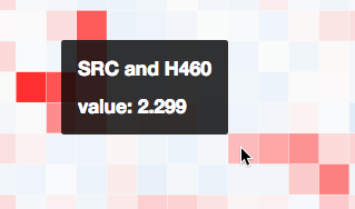
Mousing over visualization elements (e.g. matrix cell) brings up additional information as a tooltip.
See Clustergrammer-JS API for information about adding callback functions to mouseover events and Mouseover Gene Name and Description for biology-specific mouseover behavior.
Sidebar Interactions
Clustergrammer visualizations have a sidebar section that contains the following interactive components:
- Optional About section (see Clustergrammer-JS API)
- Icon buttons: share, snapshot, download, crop
- Row and Column Reordering Buttons
- Row Search Box
- Opacity Slider
- Row Filter Sliders
The sidebar contains an optional About section and interaction elements (e.g. reordering buttons) and can be hidden by clicking the gray Expand buutton (and restored by clicking the Menu button).
Row and Column Reordering
Clustergrammer’s sidebar reordering-buttons allows users to order rows and columns based on:
- sum or variance
- hierarchical clustering order
- label order
This can be useful for identifying broad patterns in the data. Users can also reorder their matrix based on the values in a single row/column by double-clicking the row/column labels. Similarly, users can reorder based on categorical information by double-clicking category labels (see Interactive Categories). For small matrices reordering events are animated to help users visually track the results of this transformation.
Interactive Dimensionality Reduction
Dimensionality reduction is a useful data analysis technique (e.g. PCA , t-SNE) that is often used to reduce the dimensionality of high-dimensional datasets (e.g. hundreds to thousands of dimensions) down to a number that can be easily be visualized (e.g. two or three dimensions). Heatmaps are capable of directly visualizing high-dimensional data, but can also benefit from dimensionality reduction.
Clustergrammer enables users to interactively perform dimensionality reduction by filtering rows based on sum or variance and instantaneously observe the effects of this transformation on clustering. Users can filter for the top rows based on sum or variance using the row-filter sliders in the sidebar and choose to show the top 500, 250, 100, 50, 20, and 10 rows. This can be useful for filtering out dimensions that are not of interest (e.g. dimensions with low absolute value sum) and determining the effect of these dimensions on clustering. For instance, we may see that columns cluster in largely the same manner when we filter out rows with low variance. Clustered views of the filtered matrices are pre-calculated by Clustergrammer-PY.
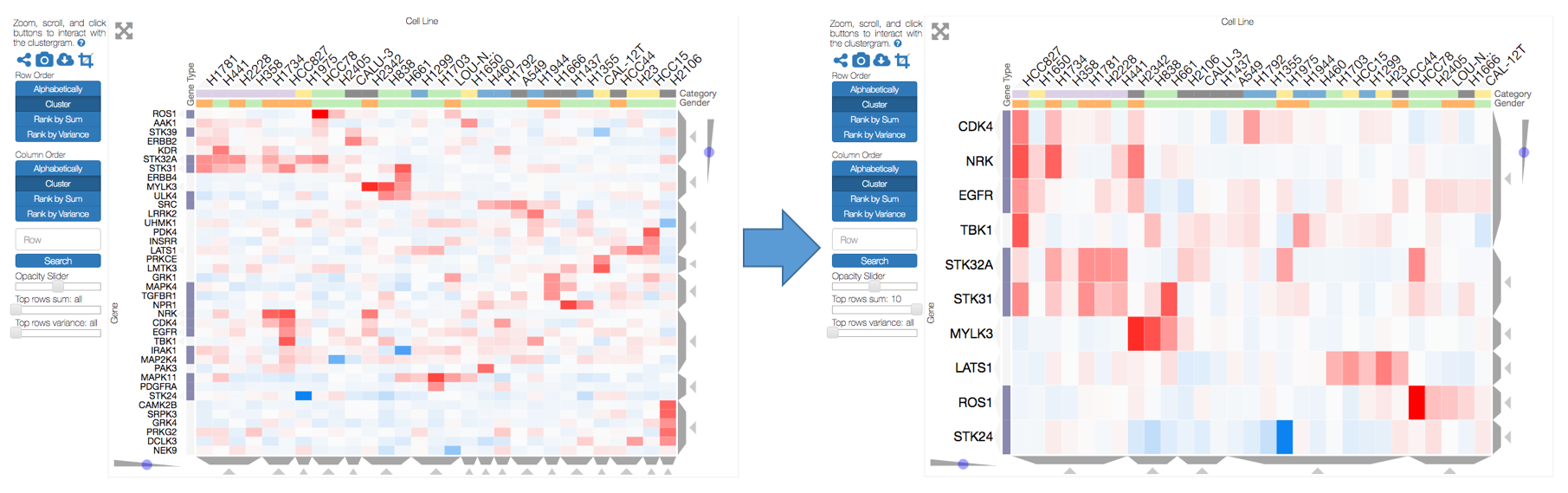
The row filter sliders in the sidebar can be used to perform interactive dimensionality reduction. Here we are filtering for the top 10 rows based on sum.
Visualizing Dimensionality Reduction
For small matrices dimensionality reduction is animated to help the user visualize the effects this transformation. Clustergrammer employs the concept of object constancy by using animations to help the user visually follow changes to their data. Filtering out dimensions (rows) occurs in two steps: first filtered rows fade out, then the remaining rows rearrange themselves into their new positions (e.g. clustering order). Adding rows back also in occurs in two steps: the current rows rearrange themselves into their new positions, then the new rows fade into view.
Interactive Dendrogram
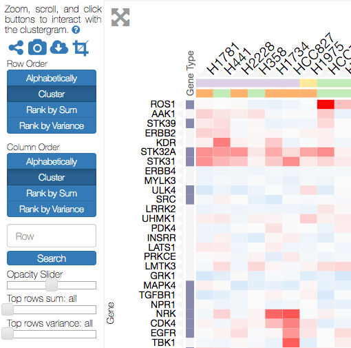
Clustergrams typically have dendrogram trees (for both rows and columns) to depict the hierarchy of row and column clusters produced by hierarchical clustering. The height of the branches in the dendrogram depict the distance between clusters. Clustergrammer depicts this hierarchical tree one slice at a time using trapezoids (see below). Clustergrammer-PY calculates hierarchical clustering using SciPy’s hierarchy clustering functions (the default linkage type is set to average, see calc_clust.py) and saves ten slices of the dendrogram sampled evenly across the height of the tree.
Visualizing Dendrogram Clusters
Rather than visualize the dendrogram as a large branching tree, which uses a lot of visualization-space and is difficult to interact with, Clustergrammer uses a more compact and easy to interact with visualization. Only a single slice of the dendrogram tree is visualized at a time as a set of non-overlapping adjacent clusters that are depicted using gray trapezoids (see screenshot below). Different slices of the dendrogram can be toggled using the dendrogram-sliders (blue circles that move along a gray triangle). Moving the slider up or down shows slices that are taken at higher or lower levels in the dendrogram tree, and thereby depicts larger or smaller clusters respectively. This interactive visualization allows users to identify clusters at different scales in their data.
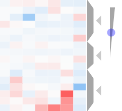
A subset of the column dendrogram along with the dendrogram slider is shown above. The slider (blue circle and gray triangle) can be used to adjust dendrogram cluster sizes – move up for larger clusters and down for smaller clusters. Each dendrogram cluster has a Crop button (gray triangle) above it that can be used to filter the heatmap to show only this cluster.
Interacting with Dendrogram Clusters
Dendrogram clusters are depicted as gray trapezoids, which are easy for a user to interact with (e.g. click). Mousing over a dendrogram cluster (gray trapezoid) highlights the current group of rows or columns (by adding a shadows over the rows or columns not in the cluster) and brings up a tooltip with cluster information (see screenshot below). If the rows or columns have categories, this tooltip will show a breakdown of the rows and columns into their categories, which can be useful for understanding how prior knowledge compares to clusters identified in a data-driven manner (e.g. we can ask whether columns with the same category cluster together based on the data). Clicking a dendrogram cluster brings up the same information in a pop-up window and also allows users to export the names of the rows or columns in the cluster. When a user visualizes biological gene-level data (row names must be genes), users have the option to export their clustered genes to the enrichment analysis tool, Enrichr (see Biology-Specific Features for more information).
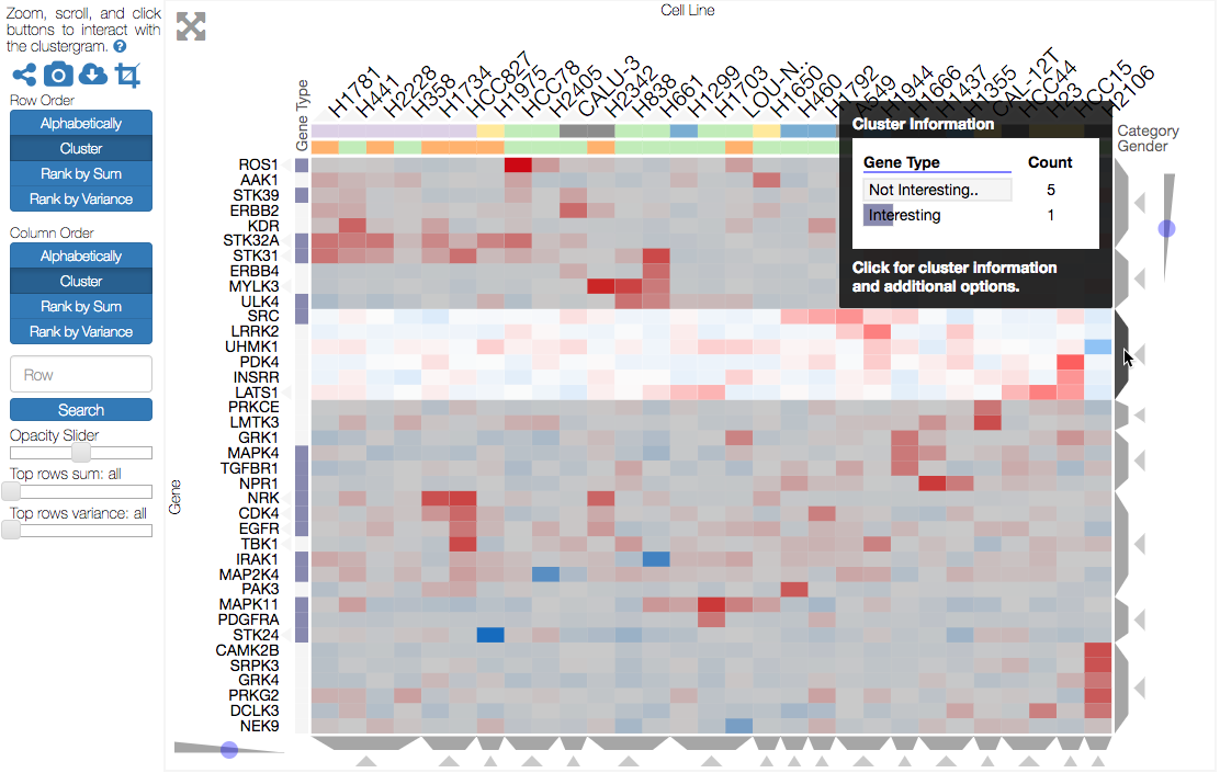
Mousing over a dendrogram group will highlight the selected cluster and bring up information (e.g. categories) about the cluster.
Dendrogrm Cropping
Each dendrogram cluster has a small triangular crop button above it pointing towards the cluster (see the above images). Clicking the crop button filters out the rows or columns that not in the cluster, resizes the visualization to show the remaining data, and reverses the orientation of the crop button. Clicking on the outward facing crop button undoes the cropping and restores the full matrix. For small matrices, this transformation is animated. Dendrogram cropping can be useful for focusing in on a cluster of interest and when used in combination with Enrichrgram to investigate the biological functions specific to a cluster of genes (see Biology-Specific Features for more information).
Interactive Categories
Prior knowledge can be represented as categories in a heatmap. For instance, columns can represent cell lines and a category can be used to represent their tissue of origin. Overlaying categories on our heatmap can help us understand the relationship between prior knowledge and the structures we find in our data (e.g. clusters). For instance, we may find that columns with the same category (e.g. the same tissue) cluster near each other based on the underlying data (e.g. gene expression) and we can conclude that the prior knowledge agrees with clusters identified in a data-driven manner. Similarly, we can explore how categories are re-distributed when the matrix is reordered. We can also use categories to overlay numerical information (e.g. the duration of drug treatment) and ask similar questions. Please refer to Matrix Formats and Input/Output for more information on how to encode categories.
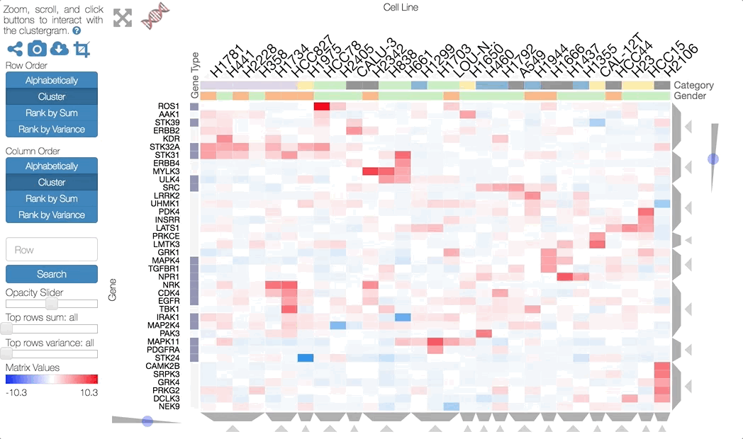
In the visualization row or column categories are represented by an extra column or row, respectively, of colored category-cells underneath the row or column labels (see screenshot below). Categories can be of type string or value (see Matrix Formats and Input/Output): each string-type category has a different color, while each value-type category has a different opacity. The categories also have titles positioned adjacent to the category-cells.
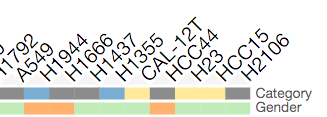
A subset of column categories is shown above. In this example columns have two categories, ‘Category’ and ‘Gender’, which are depicted as colored cells under the column labels
Interacting with Categories
Mousing over a category will show the category name in a tooltip and highlight the instances of this category (while also dimming the instances of the other categories) to facilitate visualization of a specific category (see screenshot below). Double-clicking a category-title will reorder the matrix based on this category, which can be useful for getting an overview of all categories. Mousing over a dendrogram cluster will also show a breakdown of the rows/columns in a cluster based on their categories (see Interactive Dendrogram). Users can also reversibly filter a visualization to only show rows or columns of a particular category by clicking on a category while holding down the shift key (and undo this filtering by doing the same).
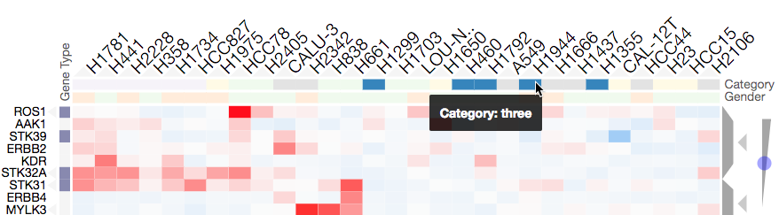
Mousing over a category brings up a tooltip with the category name and highlights instances of the category. Shown above is an example of mousing over a column category.
Updating Categories
Row categories can be updated using the Clustergrammer-JS API, which can be used by developers to add dynamically categories. This feature is used by Enrichrgram to visualize enrichment analysis results (see Biology-Specific Features for more information).
Cropping
The Brush-Cropping icon in the sidebar can be used to crop the matrix to a region of interest (see screenshot below). To crop, click the crop icon and then drag the cursor to define your region of interest. Once dragging has finished, the matrix will crop to show only the selected region of interest. Cropping can be undone by clicking the Undo button in the sidebar (which appears after cropping). This can be useful for focusing in on a small region of your overall matrix. Cropping can be used in combination with the Download Icon to export a small region of the matrix or in combination with Enrichrgram to perform enrichment analysis on a subset of clustered genes.

The above example shows the result of brush-cropping into a section of the heatmap. To brush-crop, click the Crop button (the active red icon in the sidebar on the left panel) and drag/brush your cursor over your area of interest. To undo cropping, click the Undo button (circular arrow) on the right panel.
Download Icon
Obtaining the underlying data from a visualization for re-use and re-analysis can be a tedious task. To facilitate this common task, Clustergrammer’s sidebar has a download icon, shown below, that allows users to download the matrix of data in the visualization. The downloaded data reflects the current state of the matrix; e.g. filtering, cropping, and reordering will be reflected in the downloaded data.
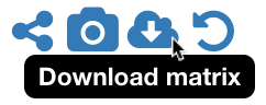
Click the Download icon in the sidebar to download a tab-separated file of the matrix in its current state.
Snapshot Icon
The Snapshot icon in the sidebar allows users to take a SVG or PNG snapshot of their visualization. This snapshot will reflect the current state of the visualization (e.g. reordering, etc) as well as zooming and panning.

Click the Snapshot icon in the sidebar to take a SVG or PNG snapshot of the matrix in its current state (including reordering, etc).
Opacity Slider
The Opacity slider in the sidebar allows users to toggle the overall opacity levels of the heatmap. Moving the slider to the left reduces the opacity, while moving to the right increases the opacity. This can be useful for working with ‘dim’ matrices that can occur as a result of outlier values.
Row Searching
Users can search for rows in their matrix using the search box. Row search includes autocomplete and animated zooming into the matrix to display the row of interest.
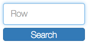
Users can search for rows using the search box in the sidebar. When a row is found, the matrix will zoom into the found row.
Expanding
Users can hide the sidebar Sidebar Interactions panel using the Expand button at the top left of the matrix. Clicking the Menu button, when expanded, returns the sidebar.
Sharing your Interactive Heatmap
Interactive heatmaps produced with the Clustergrammer-Web and the Clustergrammer-Widget (when notebooks are rendered through nbviewer) can easily be shared with collaborators by sharing the URL of the visualization on the web app or the notebook. Users can also click the share button on the sidebar (see Sidebar Interactions) sidebar to get this shareable URL.

Interactive heatmaps can be shared using the current URL, which can be obtained from the Share icon in the sidebar.
Biology-Specific Interactions
Clustergrammer has biology-specific features for working with gene-level data including:
- mouseover gene names and description look-up (using Harmonizome)
- enrichment analysis to find biological information (e.g. up-stream transcription factors) specific to your set of genes (using Enrichr)
See Biology-Specific Features for more information.